Midsommar's Architecture and Interior Design is Foreboding and Foreshadowing.
I’m not a huge horror fan. So much so that my wife and I have to take turns picking spooky movies every year so I can get my campy kids Halloween movies and she can get her horror fill. I think my distaste comes from the anxiety associated with the genre that also includes a heavy handed and not particularly relevant message. That said Ari Aster has a way of splicing genuinely funny awkward moments into an incredibly tense situation (I laughed every time an argument about a thesis paper came up). Another reason I didn’t mind the anxiety as much is due to the incredible architecture and interior design. I found myself admiring design that created the anxiety I was feeling; I almost appreciated the anxiety (almost).
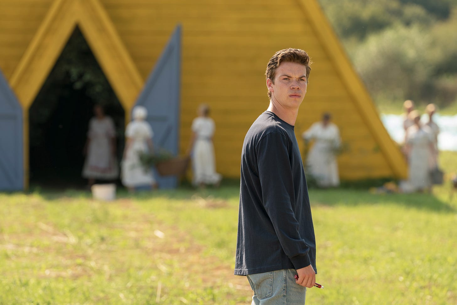
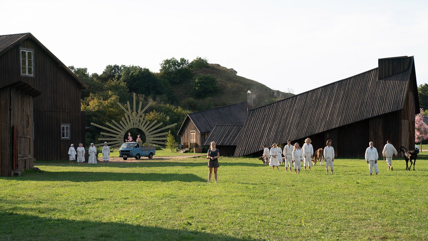
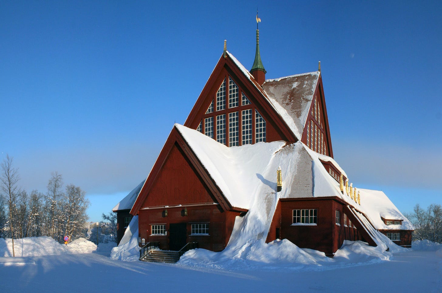
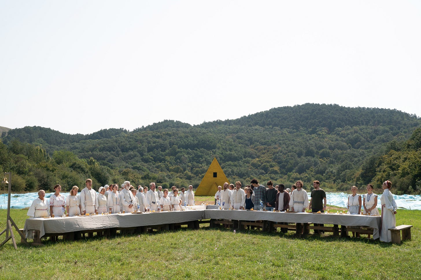
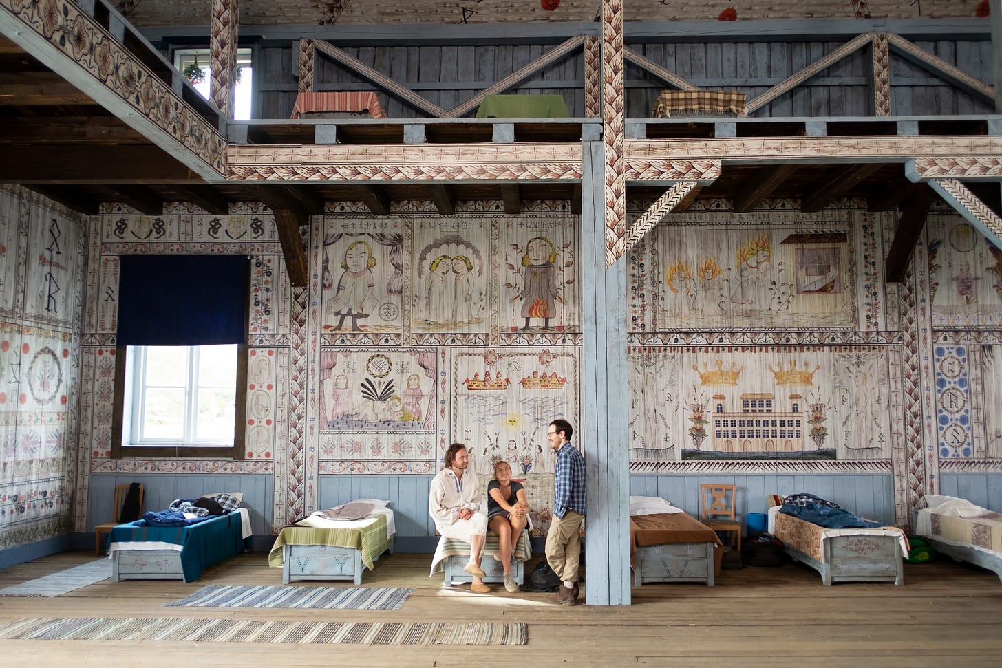
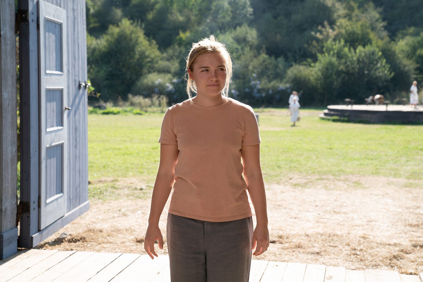
The village that Midsommar takes place in is called Hårga. It exists in the Swedish countryside surrounded by forests and mountains (shot somewhere outside of Budapest, Hungary). Aster and production designer Henrik Svensson drew inspiration for the village and structure designs from Swedish farmhouses and barns. One of the things I love about the modified Swedish vernacular architecture, is that none of the buildings (with the exception of the A-frame) are symmetrical. Almost every building has something askew, whether it is an off-center door, a skewed roof eave and ridge, etc. The material is typically dark on the exterior creating a foreboding aura in the village. The structures almost remind me of buildings in Kiruna, Sweden. The Kiruna Church in particular reminds me of the yellow A-frame.
Aster said of the village design:
“I felt it was important for audiences to be able to see different parts of the village in every shot, as though you were actually there celebrating with the Hårga,” says Aster. “I wanted the geography of the village to be something the audience comes to know in their bones by the end of the movie.”
and I think this feeling was accomplished.
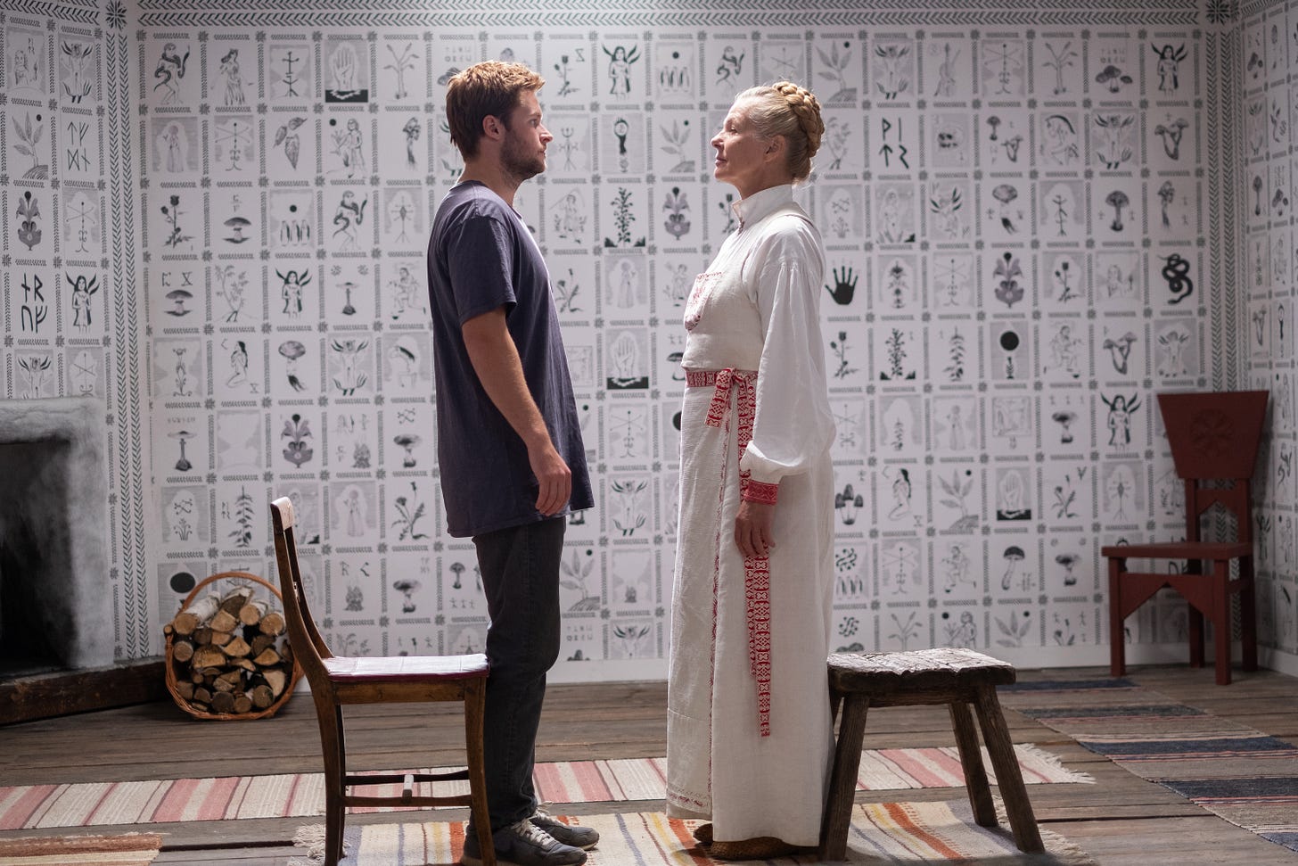
One of the most interesting elements of the entire film is how many details are included on the interior paintings. The juxtaposition of the dark stark and wonky exteriors with the beautiful light intricate interiors is striking. Each mural was hand-painted by Ragnar Persson and then turned into wallpaper by “Hungarian Artisans” (I’d love for A24 to sell this wallpaper as Midsommar merch). An amazing detail that you don’t realize until the end is that Ragnar works the entire plot into these paintings. The foreshadowing felt present, but not heavy handed. Throughout the movie I felt like I knew the paintings meant something, but I never expected them to be as literal as they were given their fantastical aesthetic.
There are many interesting design elements mentioned in the press notes regarding the language, runic alphabet, etc. but I’m not what one would call a linguist, so I’ll keep my critique centered on the architectural design.
I thoroughly enjoyed Midsommar on many levels, I just didn’t expect one of those levels to be incredible architecture.
All photographs of Midsommar are property of A24.


