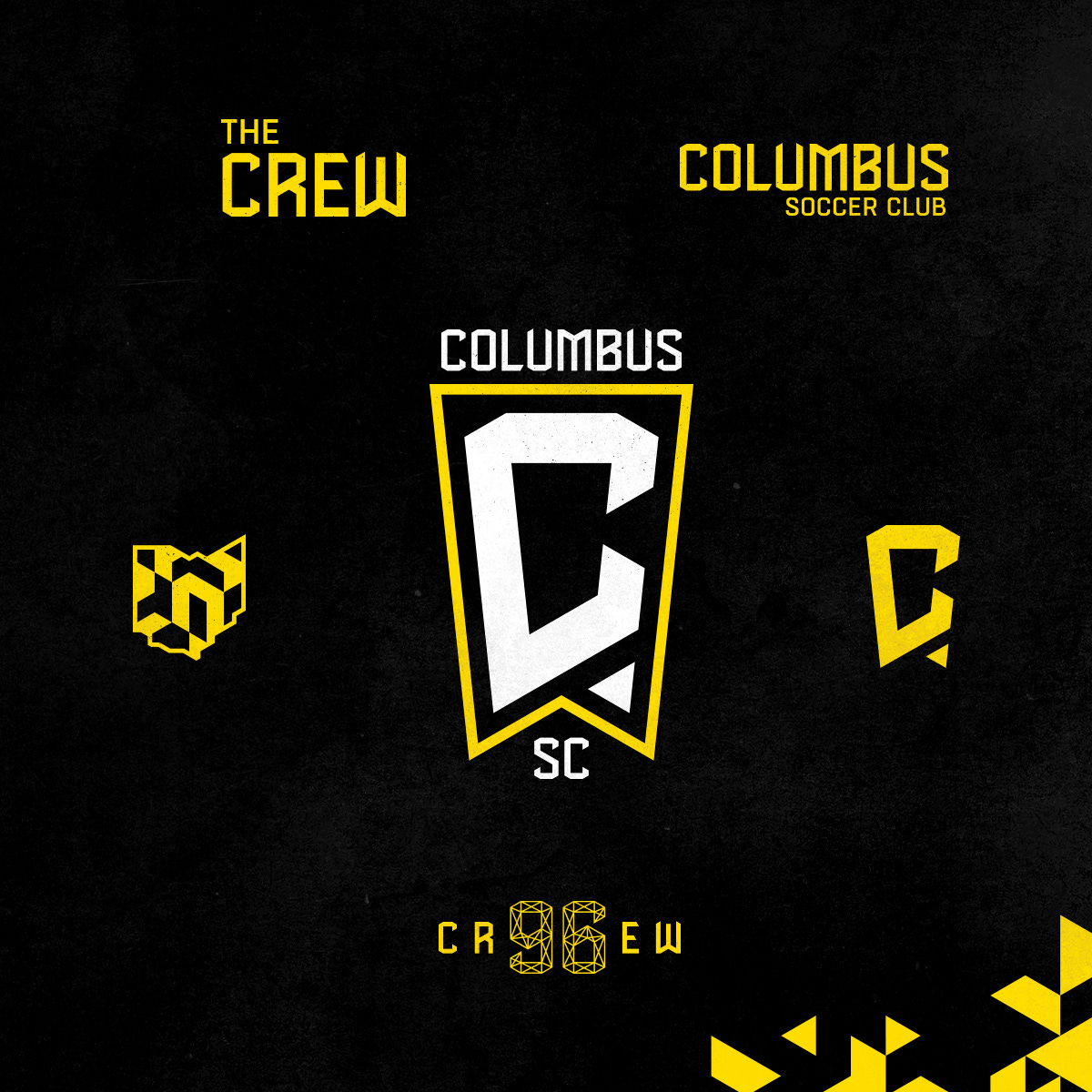
The Columbus SC Logo is Awful.
As a filthy casual fan of the MLS and specifically the Columbus Crew, I was pretty excited about winning the MLS Cup last year. Everything seemed to be going our way. We saved the team from leaving, the recently changed logo was pretty solid, and a new stadium is under construction (although I’m annoyed that the taxpayers had to fork out well over $100,000,000 to help with a stadium that most taxpayers did not want. This was the main sticking point that made them almost leave the first time. Why do multi-billionaires need help funding these absurd playgrounds for a well off minority of the population?).
This all started to change about a week ago when the Columbus Crew SC announced that they were changing the name to Columbus SC. While not a big deal, the Crew is integral to the identity of Columbus soccer fans. If anything drop the name Columbus since it is a controversial name in its own right. This has all come to a head now that the new logo has been revealed to the public, and if you thought that the name change was annoying, this logo will do nothing to alleviate that annoyance.
It’s hard to explain exactly why I hate this logo so much. Part of it is the “C” having weird sharp corners combined with chamfers. It also has to do with the little banner outline feeling pointless and confusing. Is it a reference to the Ohio State flag? Who knows, also who cares. That little triangle point in the bottom right feels tacked on, the negative space is bad, the two ends of the “C” angles look terrible.
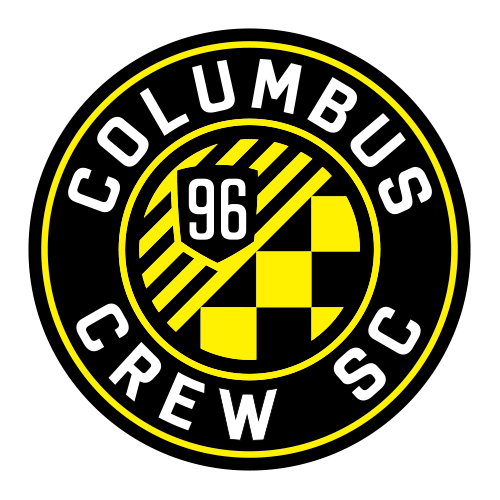
I mean compare that logo to the following which was only done in 2014.
This is packed with references and call backs to the history of one of the original charter members of the MLS. I’m not a graphic designer, but the superiority is obvious. That said, I do like the new font?


