


The Triumph of the Tragedy of Macbeth


I have been looking forward to The Tragedy of Macbeth for months. I love most of what Joel Coen puts out and I have to admit I am a sucker for Denzel Washington when he gets really great roles. He’s a powerhouse when the script gives him a chance to seriously develop a character. The cinematography is incredible and the set design looked amazing. The film met and exceeded every expectation and ultimately it felt like this subject material should not be presented in any other way. My wife and I were joking on the drive home that the weakest part of the movie was the writing and it is literally Shakespeare. While I’m not REALLY qualified to critique Shakespeare’s writing or Denzel’s acting or the cinematography, I want to talk about how incredible the set design is and how it is framed in every shot.
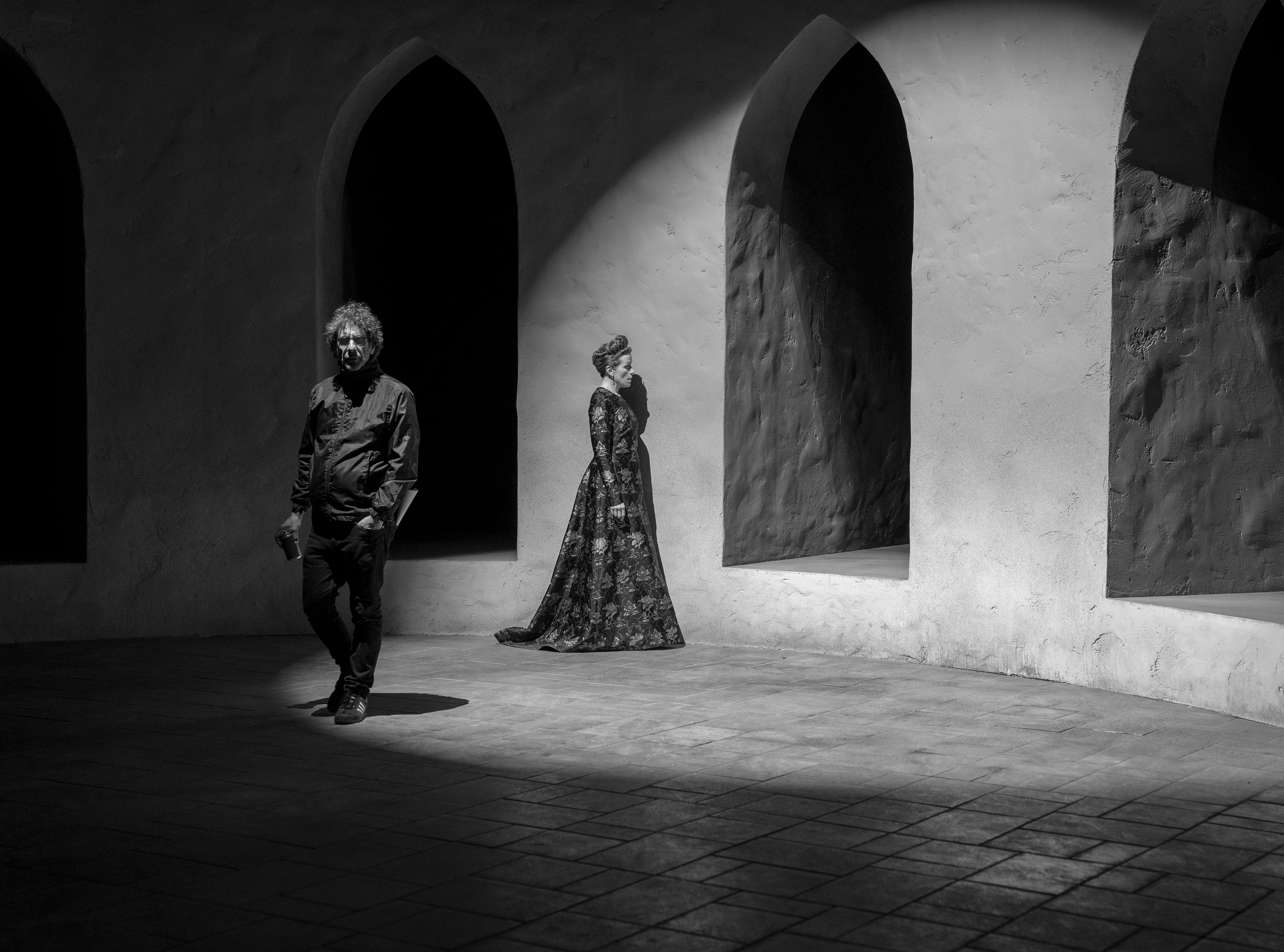
The setting of Coen’s Tragedy of Macbeth is a realm more psychological than material. It’s not 11th century Scotland nor is it our reality. It’s set apart from any country’s specific history—a palace of the mind as much of a particular kingdom.
Honestly, this quote from the A24 press notes for the Tragedy of Macbeth is more descriptive about the inherent qualities of the design than anything I could write. Though Macbeth is based on real events in Scotland’s history, this movie purposefully extracts the important parts of that culture and history and builds it into a minimalist aesthetic that allows the audience to install their own personal lore. You can imagine your own detail on the columns or arcades. With the exception of the impasto-esque quality of the plaster there is almost no material expression aside from the form itself. A modernist aesthetic at its finest and, arguably, in the way that modernism wanted to function, but could never achieve.
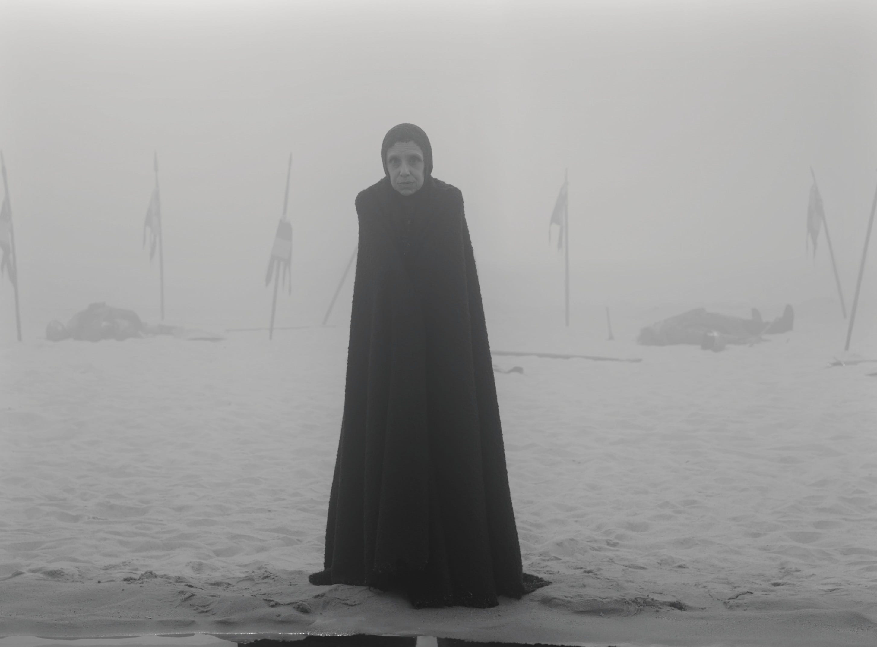
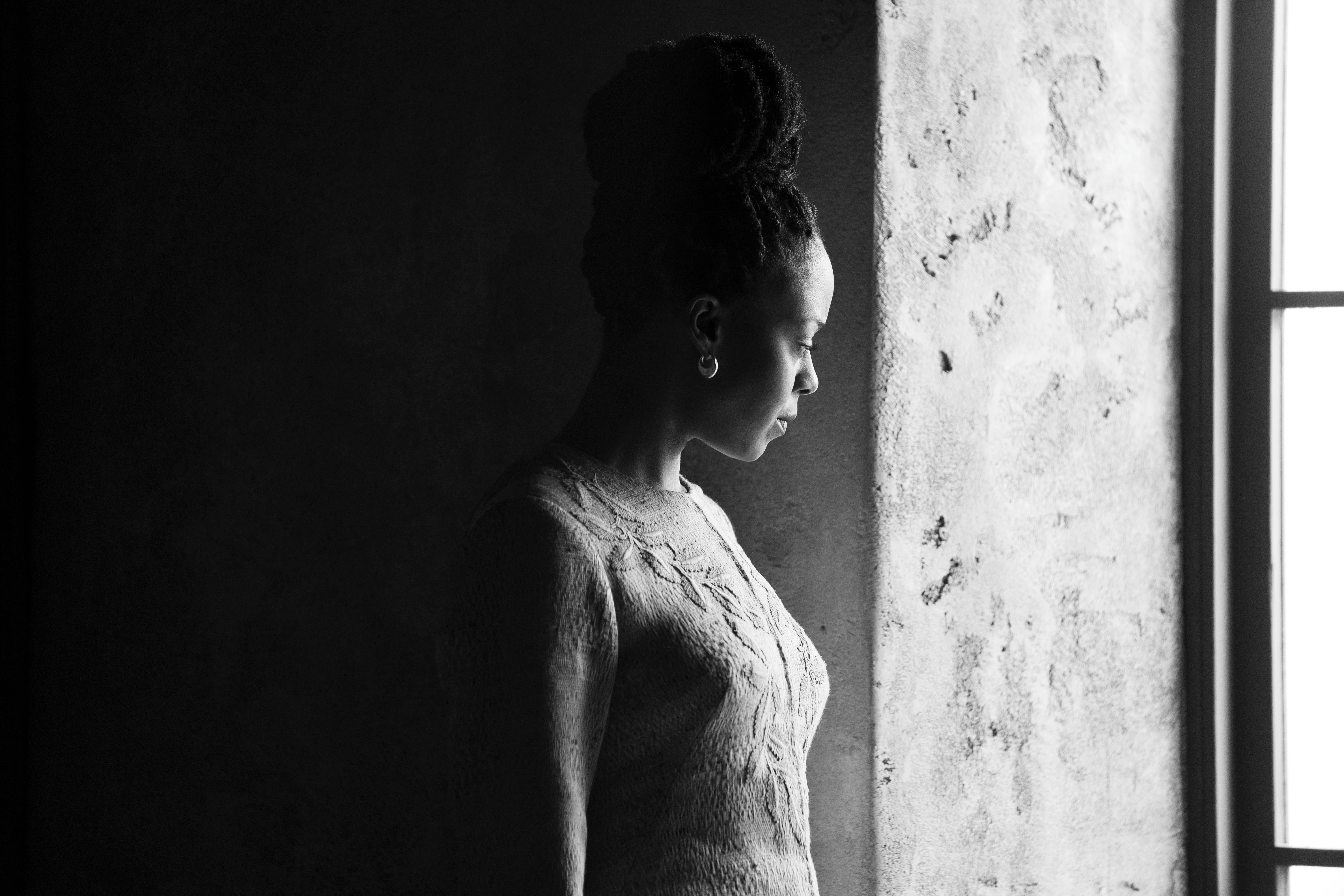
The void quality of the exterior shots is incredible. The atmosphere is otherworldly as if it has been plucked from one’s memory and detail was lost in that extraction (and filled in with something else). The important elements are framed by the fog or showered in starlight or enclosed by oppressive arcades, without ever distracting from the incredible performances.
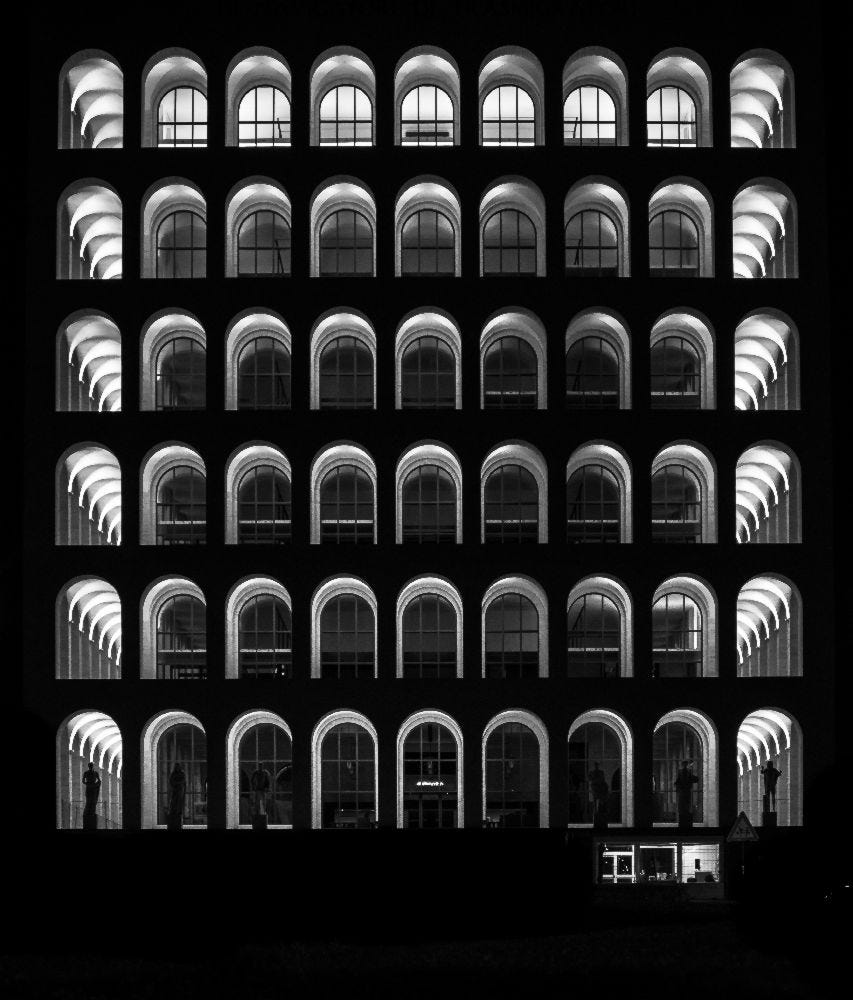
Many of the frames remind me of black and white photos of modernist and brutalist buildings. Particularly when Macbeth (Denzel Washington) is pondering the murder of the king underneath an arcade. It reminds me of the Palazzo della Civilta Italiana (pictured above). Seemingly endless arcades of concrete and plaster.
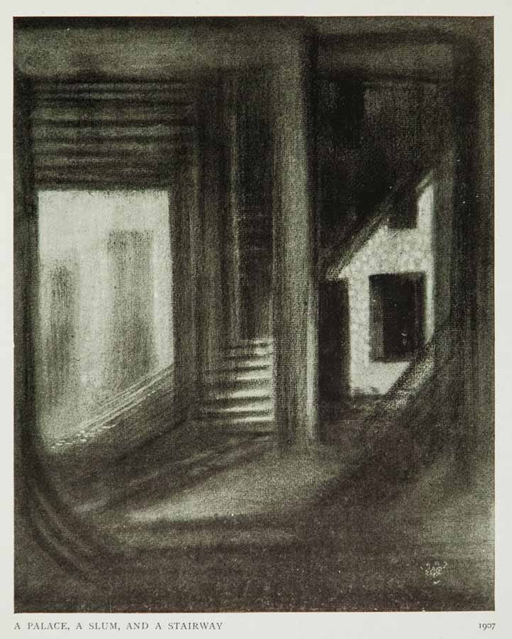
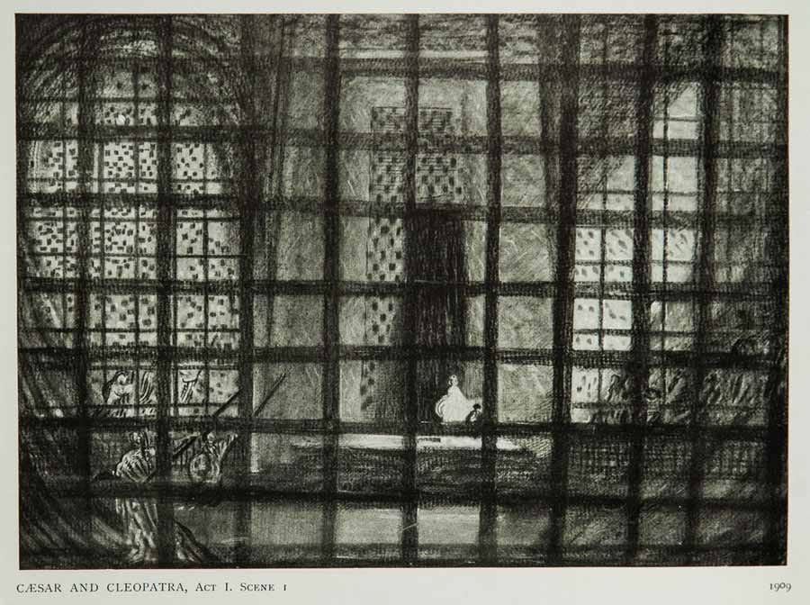
One of the biggest influences on the set design was modernist stage designer Edward Gordon Craig (set design sketches above). I have to admit I wasn’t particularly familiar with his work, but after seeing set design sketches, I am now an Edward Gordon Craig stan. His designs are simple, monumental, and emotive.
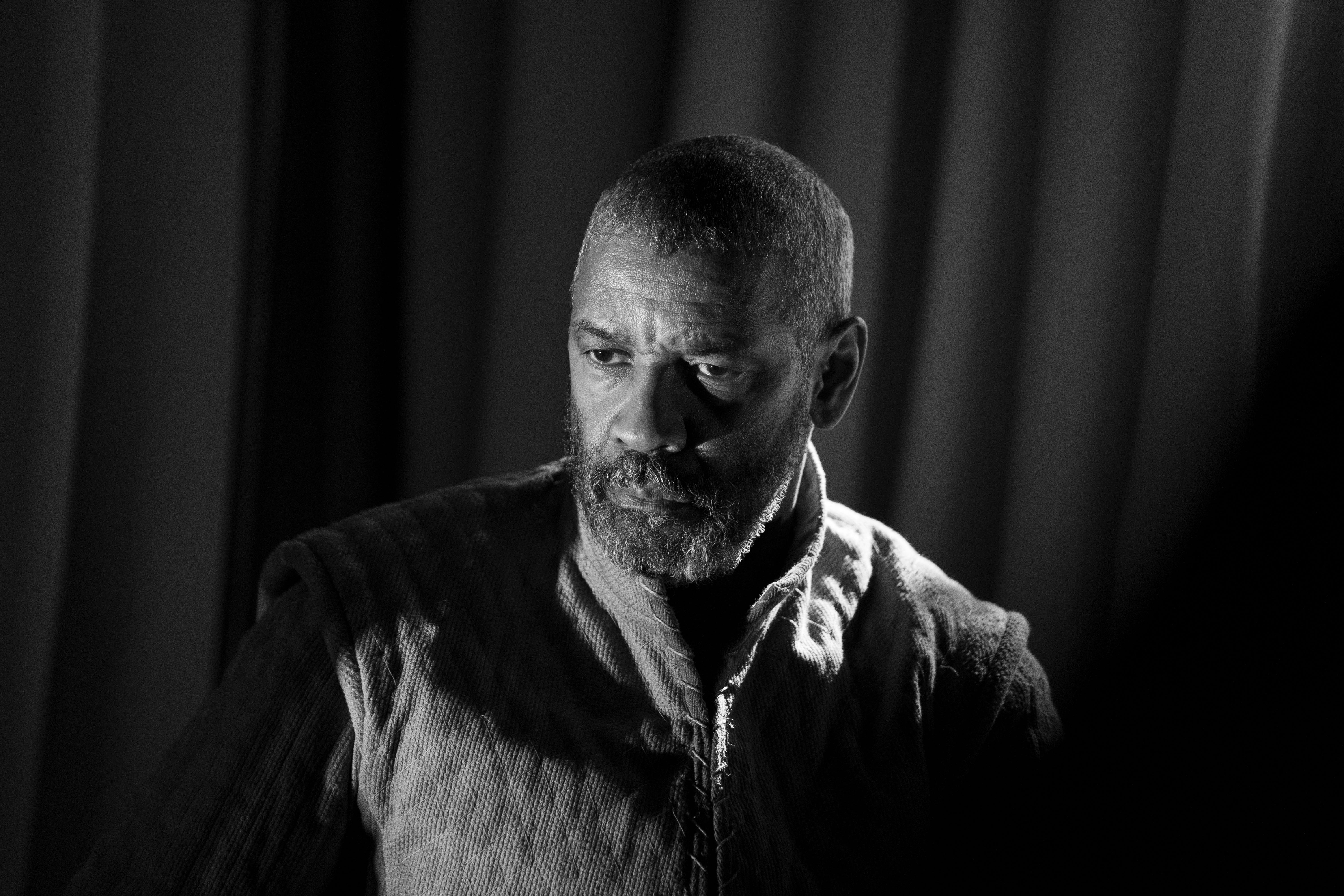
One thing the extraction from a specific period or architectural style allows for is complete control over light and shadow. Since the set doesn’t need exact proportions or details, casted beams of light and ebbs of shadow can occupy the space on their own terms.
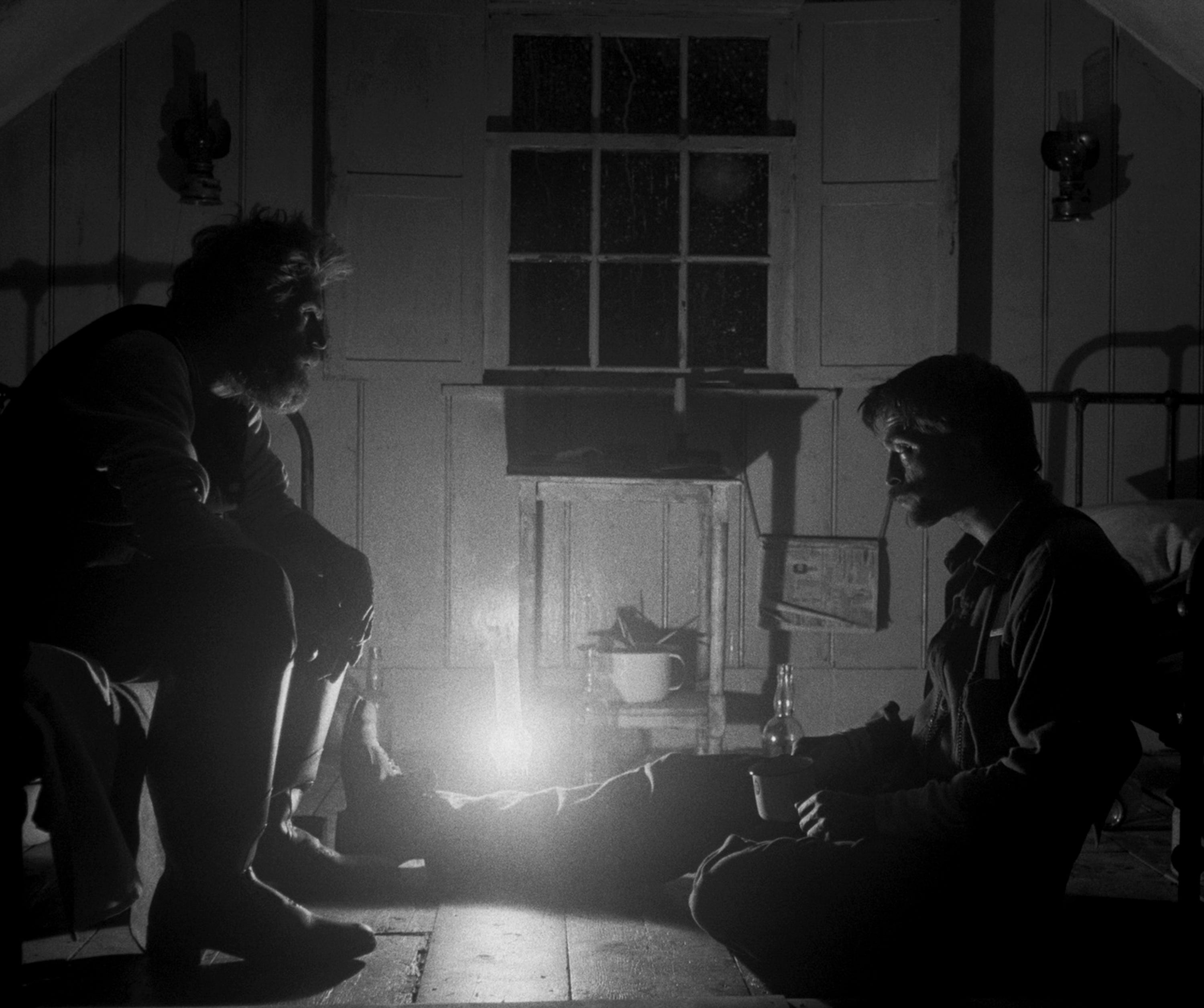
I don’t often advocate for movies to be shot in black and white, because they often lose a lot of their depth. Movies like Mank simply use it for style and not as its own character of the film (the sort of thing that Young Frankenstein lampoons). It makes far more sense in movies that are intentionally not supposed to occupy a space in reality, but instead occupy a space in our minds fading in and out of sanity (The Lighthouse seen below is an example of this).
The Tragedy of Macbeth is a success in every way that Joel Coen intended it to be. The architectural design is awe inspiring in its simplicity and light manipulation. Every scene is like a Caravaggio painting with the added emotion of incredible actors. It’s a triumph.